I’m in the process of having a logo designed for JGPR that represents our work and commitment to those who serve others. So, it occurred to me to model the JGPR logo after a “patch” used by police and fire departments.
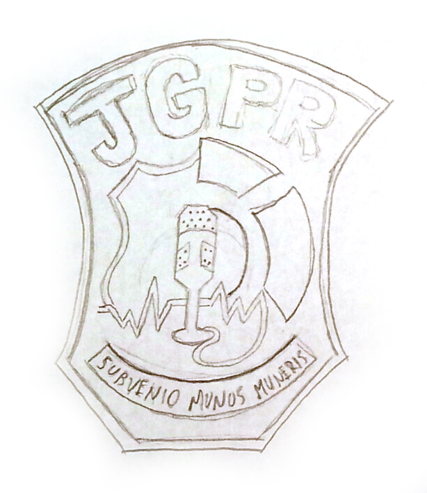
After working with an artist who specializes in designing patches, we came up with this sketch:
From that sketch, we came up with these potential logos:
It keeps the JGPR letters big and bold, with a microphone in the foreground, representing the media, and the police/fire insignia in the background. The microphone cord also trails off to a heartbeat, which I think is a great touch.
On the bottom, I added Subvenio Munus Muneris, which roughly means “Come to the aid of those who serve” in Latin.
I know there’s an argument that using a patch as a logo is a bit native, but I’ve made so many logos, and after a while, I think corporate logos all start to look, well, corporate.
But I’d love some feedback from my media and pr friends!
Here are two other designs that the artist came up with:
Discover more from John Guilfoil Public Relations
Subscribe to get the latest posts sent to your email.